Changes to the tm package!

Recently R’s most beloved text mining package was updated. One of the notable changes is the removal of readTabular. The package authors made text mining documents with metadata much easier. Instead of manually declaring metadata with a mapping scheme the package inherits metadata from a DataframeSource. While this is good the the text mining world, of course, it breaks some code in my book!

So here is some rewritten code showing what was changed from page 43 of the book. You should notice that VCorpus doesn’t need a meta data reader object as part of the function. Further, using the brackets you can see both the original document and the metadata, here only that it is #103.

#DEPRECATED:
#tweets<-data.frame(ID=seq(1:nrow(text.df)),text=text.df$text)
tweets<-data.frame(doc_id=seq(1:nrow(text.df)),text=text.df$text)

#DEPRECATED:
#meta.data.reader <- readTabular(mapping=list(content="text", id="ID"))
#corpus <- VCorpus(DataframeSource(tweets), readerControl=list(reader=meta.data.reader))

corpus <- VCorpus(DataframeSource(tweets))
corpus<-clean.corpus(corpus)
corpus[[103]][1]
corpus[[103]][2]

Keep in mind:
* If using DataframeSource the first column MUST be named doc_id followed by a text column. Any other columns are considered metadata associated row-wise.

As changes to packages occur I will try to update the book's readme file here.

Posted in Uncategorized | Comments Off on Changes to the tm package!

Decrypt Emotion with our Web App…and learn APIs in R

This post was originally published at ODSC. Check out their curated blog posts!


An API is a way for one piece of software to interact with another application.  API stands for “application program interface” allowing your application or R script to interact with an outside service.  The cool thing about APIs is that it lets you grab functionality or data without having to create it yourself.  For example when you use Google Maps to navigate, your phone sends the request to the navigation service and gets back the needed information.  Your phone doesn’t have to locally store all maps of the world or calculate an efficient route.  It just retrieves the information for the particular request through an API then displays it to you.

Many APIs are “REST” meaning the services interact with data abstractions through a URL with parameters.  In database operations there is a similar “CRUD” which stands for Create, Read, Update and Delate.  A REST API service can do these operations sometimes with additional functionality.  A short explanation between CRUD and REST is here.

In R there are various methods to interact with APIs.  In some cases dedicated packages exist like ‘twitteR’ or ‘ggmap’ for interacting with particular services.  In other cases more generalized packages like ‘jsonlite’, ‘xml2’ or ‘httr’ can be used to access APIs.  In this post I will show you how to interact with services in a couple of ways performing GET and POST requests.  GET requests obtain information, like a row of a customer database using parameter(s) you specify such as customers in Ohio.  Post requests allow you to post a file to a service either for storage, or so that the application can enact on it and return some information.  An example post request in this article is posting a photo to a Microsoft cognitive service so the service can analyze the photo’s emotion.  That way I can check for my Valentine’s reaction to my gift!

APIs with Packages

One of the easiest ways to start interacting with APIs in R is with the ggmap package.  It is a wrapper for interacting with google maps in the familiar ggplot2 functionality.  If you have spatial information I suggest working with ggmap before trying the more dynamic leaflet package.

In this code you load the library and create an object bos which is a string representing a location.

library(ggmap)

bos<-'Boston, MA'

Next, pass the string location to the get_map function.  This function is a wrapper for getting map tiles that can be used as the base layer in a ggplot.  The second line calls ggmap on the map tile that was retrieved so it can be plotted in your R session.

bos.map <- get_map(bos)

ggmap(bos.map)


The base map tile from the google map API.


A nice output of the get_map function is that it will print the URLs where the information was retrieved.  In this example the URLs include:


In the first link address you should identify “Boston,+MA” which is the center of this map.  If you change this to another city such as “Cleveland,+OH” the map center will correctly change.  The second link also has the URL encoded Boston MA as “Boston,%20MA”.  Again you can change this part of the URL to retrieve different information from the maps service.

If you click on the second link you will navigate to a small text file with structured information from the service.  In this case the page is JSON formatted.  JSON is a lightweight “JavaScript Object Notation” file that is used to pass information to a browser.    The screen shot below shows the JSON results of the API query which includes “Boston”, “United States” and starts to include latitude and longitude information.


A portion of the JSON response for Boston Ma after using get_map.


True to ggplot’s nature, you can call another API service for information and add a layer to the base plot.  To start, let’s define the starting point as “Westford, MA” and drive to the “Boston Common.”

west<-'Westford MA'

common<-'Boston Common'

After we have our starting and ending points, call the route function from ggmap and pass in the string objects.  This performs an API request to google.

route.df<-route(west, common)

The API will return a data frame of trip segments.  You can examine the information by calling route.df in your console as is shown below.  The trip is divided into segments with lat, lon, time to travel and distance information.

A portion of the route from Westford to the Common return by Google Maps Routing API.


Now that we have our route data frame we can add that information to our original ggplot map of Boston.  Using the “+” add a layer of geom_leg segments.  Within that layer specify the starting longitude and latitudes as the x, y.  Then specify endLon and endLat for the end of each segments.  Lastly pass in the route.df as the data source.  I add another layer to remove the legend but this is optional.  The resulting map that has called a few API services is below!

ggmap(bos.map)+

geom_leg(aes(= startLon, y = startLat, xend = endLon, yend = endLat, color='red'), data =route.df) + theme(legend.position="none")

The Boston map that has routing information as an additional layer.

APIs without a Package

A simple way to start learning about APIs without packages is to look at http://newsapi.org.  This is a simple service where the GET requests are straightforward.  If you look at the webpage you will see a live example with a URL “ https://newsapi.org/v1/articles?source=techcrunch&apiKey={API_KEY}” and its JSON formatted response.

Deconstructing this URL you will notice the “source=” followed by “techcrunch” and then an API key.  Following the source parameter is the string that represents a new service like “cnn.”  This tells the service which of the many services to return.  The only other parameter is the API key which is a unique identifier letting the administrator know who is accessing the service.  Previously, the google maps service did not ask for a key however most API services do.    I suggest signing up at www.newsapi.org for a key and then adding it into the code below.

Since there is no R package for the News API service you will need to parse the return.  If you look at the documentation you will see the response is given in JSON.  A great package for JSON responses is jsonlite.  This will let you access and organize data from a JSON webpage.  Further after looking at any of the documentation you should see an example URL which I added as an object called news.url.  In this example the source is CNN but that can be changed to another.  Remember to change the Xs to your key after signing up!

library(jsonlite)

news.url<-'http://newsapi.org/v1/articles?source=cnn&apiKey=XXXXXXXXXX'

Using the fromJSON function along with the web address will access the webpage and return a list containing the API’s response.

cnn<-fromJSON(news.url)

I like to examine the response because no two services are exactly alike.  Usually I use str to understand the structure of the response.  The screen shot below shows what was returned.    First was an “ok” or status 200 from the service.  Next, a header parameter letting you know that the news source was CNN followed by how the articles were sorted.  The most interesting part of the API response is the $articles element.  This represents a data frame with $author, $title, $description and $url columns.

The NewsAPI.org response using fromJSON.

Thus to extract the data frame from within the list use the code below.  This will let you save the output of start to do some text analysis.

cnn.df<-cnn$articles

She loves, she loves me not…using Microsoft’s Emotion API.

Microsoft’s cognitive services offer many interesting APIs.  From optical character recognition to text analysis and machine vision there is a lot that can be explored.  In this example I want to check my Valentine’s emotional reaction to my gift by passing their picture to the API.  We will need to POST our pictures to the service, let the service analyze it and then respond with the results.  If you are coding along, sign up at https://www.microsoft.com/cognitive-services/en-us/ The UX is horrible the service doesn’t automatically send a verification email…there is a link at the top to send it next to your email address before you can get keys.  Without verification the service just returns a 401 (unauthorized).  


There is an R package called “Roxford” which is used for accessing the Microsoft services.  However to show you what’s going on under the hood we will code a POST response without it first.


The libraries I will use are httr and rvest.  The first provides tools for working with URLs and HTTP.  The second has a function I like called pluck for working with lists.

library(httr)

library(rvest)


Lets define where the photo will be “POST”ed.  Check the cognitive services documentation for each different service because each has a unique URL.  This link is for the emotion recognition service.

msft.url <-‘https://westus.api.cognitive.microsoft.com/emotion/v1.0/recognize’

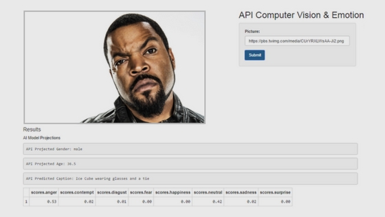
Next, create a string for the image location.  You could use a local path with some minor code changes but for now just find a photo online.  This photo is of Ice Cube who is usually known for being angry!


Ice Cube does not look happy!

The last input is to define your API key.  Microsoft Cognitive Services requires keys for each type of service.  For example to use the Computer Vision key you have one string and for this emotion detection you have another.

emo.key<-'REPLACE_with_your_key'


Within the POST function you need to specify the image location as a URL.  It’s easier to do this as an object shown below as img.loc referring to the img.url string.  The img.loc is then used in the body= parameter of the POST code.

img.loc <- list(url = img.url)


Now it’s time to POST the photo to the service.  Using POST, specify where the file should do.  The next parameters add information to the photo in JSON format.  This includes the API key authorizing you to access the service.  The resulting object msft.response is a list returned from the Emotion service.

msft.response <- POST(

 url = msft.url,

 content_type('application/json'),

 add_headers(.headers = c('Ocp-Apim-Subscription-Key' = emo.key)),

 body = img.loc,

 encode = 'json')


This will direct your R session to pass the photo to the emotion API and collect the response.  Using the contentfunction on the response, msft.response, will extract the API content for analysis.  The resulting list has a bounding box for each face (in case there is more than one) and numeric scores for 8 emotions.  The service scores on each among “anger,” “contempt,” “disgust,” “fear,” “happiness,” “neutral,” “sadness,” and “surprise.”

emo.tags <- content(msft.response)

Since I care about the emotions I next use pluck to extract the parts of the list that contain emotional scores.  The API response is passed in followed by the name of the list element “scores.”

emo.tags<-pluck(emo.tags,'scores')

Each of the 8 emotions for each face are still a list.  Thus I organize them into a data frame.  To do so, do.call is passed rbind (row bind) then the list.  The end result is a data frame with 8 columns shown below the code. Each row represents a face in the photo.

emo.df<-do.call(rbind,emo.tags)


To quickly find the highest value I like to use max.col.  This function will return the column number with the highest value.  This is used to index the colnames of the data frame.  In this example, the first column contains the highest value.  So colnames(emo.df)[1] would return the name “anger.”  Multiple emotions will be returned if there is more than 1 face in the photo.

colnames(emo.df)[max.col(emo.df)]


Emotion as a Web App

Now that you have seen some example APIs and specifically how a POST occurs let’s build a simple Shiny app that calls on these APIs for analysis.  This will make it easier for me to see if my Valentine is happy with my gift because I can quickly snap a pic, host it online and post to multiple services.  For education’s sake I added the cognitive face and vision APIs to the emotion API.    While I could write another post specifically for Shiny apps I will just do a simple walk through of this code while using the library(Roxford) functions which are convenient wrappers for the POST code above.

Shiny apps need a UI for defining the user interface and a back end server for creating the objects and information to be rendered.  The code below represents the ui.R file that creates the basic user interface.  It begins, as a fluidPage.  A fluid page layout consists of rows which in turn include columns.  In each of these cells the different objects are added.  After adding a page title I declare a fluidRow to be inside the page.   The width is 3 and then contains a text box input for an image URL and a simple submit button.  The next column in the row has a width of 8.  The total for any row must be less than 12.  Nested within this column is another row of the same width.  The tablePanel will show the image that was sent to the API service.  Below that are some text outputs representing the API responses.

The key takeaway is the naming of objects such as user.gen, user.age, user.caption, and user.emotion.  Additionally the user will input a URL picture defined as user.url.pic.  These are objects that will be defined in the server code and rendered back to the front end of the application.


Now that you have the data set, check out the rest of this post at ODSC!

Posted in blog posts, ODSC | Tagged | Comments Off on Decrypt Emotion with our Web App…and learn APIs in R

Is Your New Year’s resolution Really working out?

This post was originally published at ODSC. Check out their curated blog posts!


With the holidays long gone and likely everyone’s New Year’s resolutions along with it I figured I would spend some time working with data instead of working with gym weights.  Lacking any real inspiration, a friend pointed me to the University of California, Irvine’s Machine Learning data repository.  Specifically, he sent me the link to the PAMAP2 Physical Activity Monitoring Data Set.

This dataset contains longitudinal data from 9 subjects.  Each is hooked up to various biometric sensors that provide a reading each second.  As each subject migrates through her day the subject’s activity is also recorded like driving or playing soccer.  For a fictitious example, suppose Meghan was wearing these biometric sensors, and driving her car to soccer practice.  The sensors would provide second by second data such as heart rate during the drive.  Next, she would start her workout and again the sensors would provide data presumably with an increased heart rate.  Considering automotive telematics and personal fitness trackers all produce similar data I was intrigued to explore modeling the data as a classification problem.

Since so many New Year’s resolutions center around working out I figure it’s a fairly timely post.  First, I will show you how to get the data and organize it.  Then just a little exploratory data analysis (EDA), followed by preprocessing, partitioning and then we apply the K-Nearest Neighbor (KNN) algorithm the data.  The goal is to use biometric data to classify what activity a person is doing.

Set Up

This data is housed in a zip file on the UCI site.  Considering the size, I opted to use data.table since it reads and manipulates data efficiently.  I also use pbapply for applying functions with a progress bar.  This helps me understand how long my code is going to take when working with millions of rows.  Next, the plyr package is great for data manipulation and preprocessing.  Lastly, although I could model a KNN algorithm in multiple packages, even caret, I chose klaR because it builds KNN algorithms fast.

library(data.table)

library(pbapply)

library(plyr)

library(caret)

After downloading the zip file, you will have to unpack the “.dat” files.  Each file contains the tabled data ordered chronologically for the subjects’ data.   There are two folders with subject data.  Rather than specify files individually you can programmatically scan the folders and then amass all the biometric into a single data table.  The list.files function will search for a pattern within a specified folder.  So temp1 and temp2 become string vectors with the full file path for any files ending in “*.dat”   I concatenated the two file objects into a single object, temp.

temp1 <- list.files(path='~/pmap/PAMAP2_Dataset/Protocol', pattern="*.dat",full.names = T)

temp2 <- list.files(path='~/pmap/PAMAP2_Dataset/Optional', pattern="*.dat",full.names = T)

temp<-c(temp1,temp2)


fread will read any table into your R session.  This is applied to each individual file path in temp.  All of this is then unified using rbindlist which row binds the list containing individual subject data.

activity.data<- rbindlist(pblapply(temp, fread),fill=T)

activity.data<-activity.data[complete.cases(activity.data),]


Instead of imputing missing values I decided to omit records containing any NA values.  This is a large data set and really only a hobby post so I decided not to.  If you want to impute and therefore model on more records I usually use the VIM package and particularly the hotdeck function has been helpful in the past.  In this case I pass in the base complete.cases function into the bracketed data table.  The complete.cases function creates a T/F Boolean output.  True represents a row without any NA values.  The data table will automatically retain any T values with the code below.

activity.data<-activity.data[complete.cases(activity.data),]


The variable names are mostly incomprehensible so the code below changes them.  I simply paste the hand, chest and ankle measurements to a sequence of numbers coinciding with the data frame’s column number.  Then I declare the colnames to be a character vector with the non-measurement inputs.

hands<-paste0('hand', seq(4,20))

chest<-paste0('chest', seq(21,37))

ankle<-paste0('ankle', seq(38,54))

colnames(activity.data)<-c('timestamp','Y_activityID','heart_rate',hands,chest,ankle)


The dependent or Y feature is a multi-class factor corresponding to a person’s activity.  Although the value is an integer the data’s pdf defines the actual states.  To re-map the target feature I first create y.code.  This is a numeric vector with existing activity codes.  Then I create y.class as a string vector with each activity.

y.code<-c(1,2,3,4,5,6,7,9,10,11,12,13,16,17,18,19,20,24,0 )


y.class<-c('lying','sitting','standing','walking','running','cycling',

'Nordic_walking','watching_TV','computer_work','car_driving','ascending_stairs','descending_stairs','vacuum_cleaning','ironing','foldinglaundry','house_cleaning','playing_soccer','rope_jumping','other')


The mapvalues function accepts a vector of values to change then a “from” and “to” parameters.  The code passes in the activity.data$Y_activityID vector followed by y.code and y.class.  The code snippet rewrites the existing activity.data$Y_activityID.  The second line changes the remapped values from characters to factors.

activity.data$Y_activityID<-mapvalues(activity.data$Y_activityID,

                                     from = y.code, to = y.class)


activity.data$Y_activityID<-as.factor(activity.data$Y_activityID)


The target feature is now a factor corresponding to the data dictionary.  Check it out with sample and an integer e.g.

sample(activity.data$Y_activityID,10)


Quick EDA

Although not the point of the post, it’s a good idea to perform EDA anytime you are modeling.  At a minimum I like to tally the target feature.  This will help you understand if you have severely unbalanced targets which affects how you construct a model matrix.  Use table on Y_activityID to print the tally.

table(activity.data$Y_activityID)


You can also make a quick visual by nesting the table data inside barplot.  So the labels do not get cut off, specify margins in your graphics device.  This is done with par and declaring mar with integer values that provide the cushion around the edges of the plot.  Next take the previous code and nest it in barplot.

op <- par(mar=c(11,4,4,2))

barplot(table(activity.data$Y_activityID),las=2, col='darkred')

The activity distribution from the 9 subjects.

The basic EDA function summary can be applied to a data frame and will return information for each vector.  To save time on this large data set, I took a random sample of the entire data table.  It’s easy to sample a data table using the code below.  You can use sample within the indexing code by first passing in the .N follow by the number of records to sample.  This code will grab 10,000 records to create eda.sample.   Now calling summary on the subset data will calculate the information faster.

eda.sample<-activity.data[sample(.N,10000)]

summary(eda.sample)

A screenshot of the sampled activity data showing the summary information for some inputs.

An Irresponsibly quick KNN explanation

The KNN algorithm is an analogous method.  This means the predictions come from similar or analogous records.  This is a common sense approach.  Let’s say you have data shown below in a scatter plot with 2 classes Red and Green.

This visual represents your training set because the target, red or green, is known.  Now you are presented a new record shown as a grey triangle in the graph below.  Would you guess the unknown record is red or green?

If you look at the nearest neighbors to the triangle you may guess the new record is a red dot.  This new record is analogous to the closest records.

A tuning parameter of KNN is the number of nearest neighbors.  You have to specify the number of neighbors in case new points are equal distance to both classes.  For example this graph shows a more centered grey triangle.  If you are restricted to a single neighbor you wouldn’t know which class because the triangle is exactly in between opposing markers.   This makes it harder to pick a color if you are looking for the single closest Red or Green marker.  So instead a K =3 in KNN would improve the results.  For the sake of this illustration I added arrows to the closest 2 dots.  1 of the 3 neighbors is RED, the other 2 are GREEN so the probability of being green is 66%.

Keep in mind that distance is measured as Euclidean meaning the straight line distance to the nearest known record.  Remember your Pythagorean Theorem days in geometry?  That’s the stuff of Euclidean distance.  Also this data is complex and distance occurs in hyperspace not the 2 dimensions shown.


Center & Scaling

The problem with measuring Euclidean distance is that any values that have different orders of magnitude will impact the KNN algorithm significantly.  For example, if you were modeling customer outcomes and income is measured in thousands and number of children were (likely) single digits, distances between incomes will seem larger than between children.  In this approach you have to scale and center your inputs.

To understand the impact of scaling and centering apply it to the eda.sample data.  The scale function can be applied to the data frame with additional parameters set to TRUE.

Keep in mind that you do not want to scale the dependent variable just the inputs.  

Also I don’t scale or even model on the timestamp feature.  This removes the temporal aspect of the modeling, since from second to second a subject is likely doing the same activity.  You could feature engineer an input that captures the longitudinal information in the timestamp but I just omit timestamp and the target using the index 3:54 below.

eda.scale<-scale(eda.sample[,3:54, with=F],center=T,scale=T)


Now you can compare the summary output on the eda.scale to eda.sample.  Notice the mean for all vectors is now 0.  Centering a vector subtracts the mean average from each individual value.  Scale will divide the new value by the vector’s standard deviation.  Essentially this normalizes each value to its distance from an average of 0 and puts the values on the same scale so no single attribute would dictate a larger Euclidean distance.

summary(eda.scale)

A portion of the eda.scale summary with mean at zero.


Now that you understand the center and scaling function let’s apply it to the entire data set.  The first input to scale is now activity.data[,3:54, with=F].  The second line simply adds the dependent activity to the new scaled inputs.

activity.scale<-as.data.frame(scale(activity.data[,3:54, with=F],center=T,scale=T))

activity.scale$Y_activityID<-activity.data$Y_activityID


Now that you have the data set, check out the rest of this post at ODSC!
Posted in blog posts, ODSC | Tagged | Comments Off on Is Your New Year’s resolution Really working out?

How close am I to an Amazon, Wal-Mart or Target Warehouse? Visualizing geospatial Information in R.

This post was originally published at ODSC. Check out their curated blog posts!


In the last post you saw the “Traveling Santa Problem” which attempts to efficiently route Santa to all US warehouses from Amazon, Wal-Mart and Target.  Now that Santa has made his deliveries I want to know where to go to pick up my gift.  My wish list has a ticket to ODSC West and an Amazon Echo on it so I am hoping he dropped it off on his “Traveling Salesperson Problem” route shown below.

Santa’s route brought him close to my home in Boston to drop off my ODSC ticket and Echo!  Learn how to calculate an efficient route between a set of points, in this case warehouses, in the last post.

Set Up

If you have read any of my other blog posts you have probably seen these packages before.  Just in case I will run through them quickly.  The ggmap library is used to grab information from Google Maps API and the outputs can be used in ggplot2 visualizations.  So I also use ggplot2 and a helper package called ggthemes for predefined aesthetics.  The last two packages, sp and leaflet are less typical but very useful for geospatial data.  The sp library provides functions for create spatial data frame objects and manipulating them.  The leaflet package is a wrapper for the JavaScript leaflet package and will create an interactive map of warehouses.

library(ggmap)

library(ggplot2)

library(ggthemes)

library(sp)

library(leaflet)

I specify the decimals points should print out to the 15th decimal point.  This is helpful when examining latitude and longitude coordinates.

options(digits=15)

Get the Data & Geocode Your Location

Grab the CSV file here.  Once you have it downloaded, put it into your working directory.  In setwd, enter the folder path and change the slashes if you are on Windows. When I was first starting out I always forgot to switch my slashes!  One of my favorite functions is dir.  This will return any files in the folder that meet a pattern condition.    Once the files are printed to your console simply copy/paste the file you want to load into the read.csv function.  Often this is faster than manually typing a file name.  After the warehouses object is created you need to change the vector classes so here is an example of nesting as.character and as.numeric on $sq_ft.  This will change the vector from a factor to text then to a number.  Withoutas.character the factor is changed to numeric in a sequence in which is appears in the data set.

setwd('C:/Users/someUser/Desktop/Folder')

dir(pattern='*.csv')

warehouses<-read.csv('warehouse_stats_w_latlon.csv')

warehouses$sq_ft<-as.numeric(as.character(warehouses$sq_ft))

I live in Boston, Massachusetts so I need to get the exact latitude and longitude combination.  Luckily  the geocode function from ggmap accepts a text location to search the google maps API.  Keep in mind there is a 2500 geocoding limit per day so try not to geocode a large vector or you could try another service like Bing Maps (25000 daily limit).  To see the returned object call loc.coords in your console. The object is a small data frame with lon and lat columns and the corresponding values for “Boston, Ma.”

my.loc<-'boston, ma'

loc.coords<-geocode(my.loc)

loc.coords

Since I manually collected the warehouse information some of it was hard to come by and verify.  Sometimes I had to enter NA but this can cause problems in some functions.  To remove lat/lon combinations with NA use subset.  Subset accepts the data frame to be subset and a logical condition.  In this example the logical expression uses complete.cases applied to the $lat vector.  This function will return a logical vector TRUE or FALSE is the row is complete (has no missing or NA values).    So complete.latlon is a subsection of the original data frame where $lat values are complete, containing a number.

complete.latlon<-subset(warehouses, complete.cases(warehouses$lat)==T)

Find my Gift at a Warehouse! Closest Point to My Location

Using SpatialPoints you can tell R that the $lat and $lon vectors are not independent but in fact coordinate pairs.  The function accepts a data frame of coordinate pairs and then projection and coordinate system information.  The projection is specified as longlat and the coordinate system is WGS84.  These are standard for most maps but there are other map projections you may need to specify in other instances.

warehouses.coords <- SpatialPoints(coords = data.frame(lon=complete.latlon$lon,                                          

lat=complete.latlon$lat), proj4string=CRS("+proj=longlat +datum=WGS84"))

Next I need to create another SpatialPoints object so the distances can be calculated between the two objects.  I am only concerned with my location, Boston Ma, but you could construct a larger data frame for multiple point calculations.  This code follows the same pattern as warehouses.coords.

my.coords <- SpatialPoints(coords = data.frame(loc.coords),

                 proj4string=CRS("+proj=longlat +datum=WGS84"))

Calculating the distance between each warehouse and Boston MA is easy using spDists.  In this code I am adding a new column to the original complete data called $distance.  The spDists function accepts the first coordinate pair object, warehouses.coords then the second my.coords.  Since the second only contains a single value, it is recycled for each warehouse.  The last parameter specifies if the coordinate pairs are part of the longlat projection.  If longlat=F then Euclidean distance is returned, like you probably did in geometry class.  Here longlat=T so the “great circles” distance is calculated.  This is a truer measure of distance to points on the spherical Earth.  In the end the $distance vector represents the kilometer distance between my location, Boston, and each individual amazon, Wal-Mart or Target warehouse.

complete.latlon$distance <- spDists(warehouses.coords, my.coords, longlat=T)

The next code quickly identifies the warehouse with the minimum distance to my location.  This is done with which.min while indexing the rows of complete.latlon.  which.min returns the row position of the minimum value in the vector.  This integer can be used to index the rows within square brackets.  I created closest.warehouse and call it in the console to get the information for the single closest location.

closest.warehouse<-complete.latlon[which.min(complete.latlon$distance),]

closest.warehouse

I need to go pick up my ODSC ticket and Echo at an Amazon Food Warehouse at 201 Beacham Street in Everett MA.  If I had a team of flying reindeers this location would only be 3.8 kilometers from my location.

Unfortunately, I have to take a car so I need routing information.  The ggmap library provides a method for accessing the Google route API with route.  To get turn by turn directions I apply as.character to the $location of the single closest warehouse.   In this example 201 Beacham St Everett MA will be passed to route.

warehouse.address<-as.character(closest.warehouse$location)

To get the route data frame with directions pass in a starting location as text such as “Boston, MA” and an ending location, “201 Beacham St Everett MA.”  The returned data frame has meters, kilometers, miles, duration and lat/lon turning points for my ride.

route.df<-route(my.loc, warehouse.address, structure = 'route')

A great way to quickly get a map is with qmap.  This is similar to the ggplot2 shortcut function qplot.  In this code pass in the map location, my.loc and a zoom integer.  Then I add a geom_path layer.  Keep in mind geom_path plots line segments in the order they appear in the data frame.  In contrast geom_line will plot them in the order of the X axis.  You can see the different by changing the function in the layer.  The geom_path needs the route data frame with aesthetics for x and y.  Then I added a thick red line so I could see the route on the map easily.

qmap(my.loc, zoom = 13) +  

  geom_path(data = route.df, aes(= lon, y = lat),  colour = "red", size = 1.5, lineend = "round")

The route from my location to the nearest Amazon warehouse for my gifts!

Next I will want some idea of what the building looks like.  One way to find that is by calling a satellite image of the destination from Google Maps.  The way ggmaps works is to first get the base layer map.  Here I am creating a base called ind.warehouse.  Using get_googlemap I specify a center of the map as the lat/lon pair for the warehouse.  Next the scale for pixel resolution and most importantly maptype are declared.  I want an actual picture so I pass in “satellite” but you could use “terrain”, “roadmap”, or “hybrid” for other types.  Then I specify 17 as the zoom integer so the image is close up.  The last parameter creates a small data frame with coordinates for a marker at 201 Beacham Street.  In the end this function will retrieve the appropriate map tile to use as my base layer.

ind.warehouse <- get_googlemap(center = c(lon = closest.warehouse$lon, lat =closest.warehouse$lat),

scale = 2, maptype = 'satellite', zoom=17,

markers = data.frame(lon = closest.warehouse$lon,

lat = closest.warehouse$lat))

Since I just want to plot the picture I simply call it within ggmap.

ggmap(ind.warehouse, extent = 'device')

Not surprisingly the Amazon Warehouse is a large building…containing my gifts!  

Explore all Amazon, Wal-Mart & Target Warehouses with LEAFLET

Leaflet is an open source JavaScript library for creating interactive maps.  It is lightweight and can be rendered on a mobile browser so it is useful.  R has a package called leaflet that creates the HTML with JavaScript for these maps.  To learn more about leaflet check out the project’s webpage.

The leaflet package authors use the %>%, “pipe,” operator to pass objects to functions.  This is useful to create clear and concise code.  However, if you are just learning this can be difficult to understand.  Instead I create a map following the same linear construction as you have seen in this post but you will want to get used to using %>% as you become more familiar with the leaflet functions.

To begin pass in the complete lat/lon records to leaflet.  The leaflet function cannot handle NA values.  This function creates an HTMl “widget” that will ultimately render my map.  The dynamic.map HTML widget is just HTML without “tiles.”  The tiles layer of the map contains the background map images.

dynamic.map<-leaflet(complete.latlon)

dynamic.map<- addTiles(dynamic.map)

Calling dynamic.map in R Studio will open up the Viewer image of the Earth projected flat.  I need to add one more layer containing the warehouse information so it can be plotted on top of the tiles.  Before plotting the map with markers I want to color code markers by retailer.  For example, orange dots will represent Amazon, blues will be Wal-Mart or Sam’s Club and red will be Target warehouse locations.  So I first create a color palette mapping to the unique factor levels of $retailer.  To do so I use colorFactor, declare my colors and then the domain containing the data for assignment.


Now that you have the data set, check out the rest of this post at ODSC!

Posted in blog posts, ODSC | Tagged , | Comments Off on How close am I to an Amazon, Wal-Mart or Target Warehouse? Visualizing geospatial Information in R.

Mapping Amazon, Wal-Mart & Target Warehouses: Which route would Santa take to visit every warehouse in the US?

This post was originally published at ODSC. Check out their curated blog posts!


Let’s face it, if you’re American and you celebrate Christmas chances are you have visited Target, Wal-Mart or shopped at amazon.com this holiday season.  Even if you haven’t shopped there you probably are getting something from one of these retailers…let’s hope it’s a good old fashioned data science book.  The only other gift worth having is a ticket to the next ODSC!

Combined these retailers made $187B in Q4 last year.  To support that much product moving around the country there has to be an extensive logistics network.  I wanted to explore this unseen backbone of US consumption so I painstakingly gathered warehouse information from various sites.  Not surprisingly complete, and unified data was hard to come by.  I suspect each retailer wants to keep their distribution philosophy as secret as possible.  That would avoid competing for the same labor pool in an area, defining the cost of real estate and distance to population centers.  Still with some late nights I persevered and unified almost complete data, largely manually collecting and trying to cross validate in multiple sources.

In this post we will pretend Santa has to visit each of the warehouses so the Elves’ toys can be disseminated to all the children and good data scientists in the US.  Along the way you will learn some basic mapping and routing techniques you can use the next time you have geospatial data.

Set Up

This work is an example of “GIS” which stands for geospatial information systems.  Admittedly, I am no expert in this field, but find it fascinating to visualize geospatial data.  I like to use a basic package maps during EDA for geospatial data.  It has quick and easy, although somewhat unappealing map information for plotting.  Then I load both ggplot2 and ggthemes which are among my favorite R visualization packages.  Next, the TSPpackage is a simple package for “traveling salesperson problems.”  This type of problem is one where you are trying to minimize the distance traveled from among multiple points in space.  As you can imagine this is complex and has real world implications.  Delivery companies, or in our case, Santa, do not want to waste effort by picking a suboptimal route.  In this post, we suppose Santa is like a traveling salesman that has to efficiently travel between Amazon, Target and Wal-Mart warehouses because he only has a day to do it.

Lastly, I change the number of decimals that R will print to be 15 using options.  When working with specific latitude and longitude values it is helpful during EDA.  I also use set.seed so your code will create the same visualizations as I do for the TSP map.


library(maps)

library(ggplot2)

library(ggthemes)

library(TSP)

options(digits=15)

set.seed(2016)

Next, go get the data here and load it using read.csv.  When parsing the data frame the vector classes are incorrect so I use as.numeric to change the $sq_ft.  You may want to change the others as you explore the data more.

warehouses<-read.csv('warehouse_stats_w_latlon.csv')

warehouses$sq_ft<-as.numeric(as.character(warehouses$sq_ft))


Exploring the Warehouse Locations

It’s always a good idea to perform basic EDA on a new data set.   I usually start with head to examine a few rows.  This code will print the top 10 rows to your console but the default is 6.   You will notice the column names and also some NA values.  This data was challenging to obtain so in some cases I used NA or it was returned when I geocoded the location for lat/lon.

head(warehouses,10)

Since I collected multiple retailers you may be interested in the distribution among the companies.  Using table will tally the retailers.  I also use barplot in the second line to visualize the frequency of warehouses. Surprisingly Amazon has more warehouses than Wal-Mart.  This despite the fact that Wal-Mart does about 4x the annual revenue.  Clearly the organizations think about distribution efficiency differently.

table(warehouses$retailer)

barplot(table(warehouses$retailer))

Amazon has more warehouses even when adding Sam’s Club to the Wal-Mart.

A popular base function is summary which can be applied to an entire data set.  However, a more nuanced way to explore data is to summarize the features by another feature.  Summary can be applied in this manner using tapply along with the vectors $sq_ft and $retailer.  The tapply function applies summary to each cell of the intersections of the vectors.  The result is a list summarizing the square footage of warehouses for each retailer.

tapply(warehouses$sq_ft, warehouses$retailer, summary)

Comparing the median values from the code above shows that Wal-Mart is committed to larger warehouses resulting less of a need compared to Amazon.  Specifically, amazon’s median warehouse size is 449,000 compared to Wal-Mart’s 880,000.

To get more feature interactions the aggregate function can be helpful.  This code will provide the mean average square foot by retailer and by warehouse type.  In the second parameter pass in a list containing the features for subsetting.

aggregate(warehouses$sq_ft, by=list(warehouses$retailer,warehouses$type), FUN=mean,na.rm = T)

This code lets you compare the size of each retailer’s warehouse according to its function.  For example the table is a portion of the aggregate result comparing average “food” distribution center size for the three retailers.

Retailer Type Sq_Ft
Amazon Food 317,589
Target Food 431,600
Wal-Mart Food 802,195

Again, you can see that Wal-Mart is committed to large warehouse centers by type.

During your EDA you should have observed multiple NA’s.  Often geospatial functions fail with NA lat/lon values.  A quick way to exclude them is with subset.  Since a latitude that is NA will also have a longitude NA this single line of code will remove any rows that meet the logical declaration for either lat or lon.  The complete.cases function is my declaration and returns a TRUE if the row contains no NA values.

complete.latlon<-subset(warehouses,

complete.cases(warehouses$lat)==T)


Quick Map

To get a quick EDA map visual I like to use the map function.  First plot the line map and specifying “state” to get the lower 48.  Next add points to represent each fulfillment center.  The X values are longitude and the Y are latitude.  Lastly, I tell R to plot 4 colors and in 4 different shapes.  This is because there are 4 different retailers, Wal-Mart, Sam’s Club, Target and Amazon.

map('state')

points(complete.latlon$lon,complete.latlon$lat, col =c('orange','blue','red','yellow'),pch =c(16,17,18,19))


The result isn’t pretty but during EDA I am less concerned with aesthetics. The point is that there are dense East coast and West coast clusters no matter the retailer.  This type of quick map is used to find some insights but isn’t really presentation worthy.


A quick map showing a lot of Eastern warehouses and none in Idaho, Montana, Wyoming, and the Dakotas..

The Traveling Santa Problem

Santa will be busy and not have much time to get all these gifts to the warehouses around the US.  To help him Mrs. Clause, a Kaggle Grand Master, knows that data science can help.  To get started, the ETSP function accepts and an X and Y vector within a matrix.  This problem is a Euclidean Traveling Salesperson Problem (ETSP) since Santa can fly straight measured as Euclidean distance between points.  In “reality” Earth is a sphere so a great circles approach is really what airlines would use.  Remember these points represent each warehouse location and the goal is to to minimize the distance he has to travel so.  The solve_TSP function applies heuristics solutions to the problem of minimizing the distance traveled.  Here I selected two_opt which essentially looks to minimize how often Santa would backtrack over his route.  A good article on the approach is here.  Another approach in solve_TSP is “nn” which stands for nearest neighbor.  In this case the function selects the nearest warehouse in turn but allows for Santa crossing over his path again.

latlon.m<-ETSP(cbind(complete.latlon$lat, complete.latlon$lon))

santa.tour<-solve_TSP(latlon.m, method = 'two_opt')


To examine the result, print santa.tour in your console.  This will print the class and length of Santa’s trip but this is in Euclidean distances of lat/lon so it’s not that helpful.  Instead use plot to see the entire route firsthand.  In this example I did not specify a start= value.  Technically Santa would be coming from the North Pole which is 90,0 but I didn’t bother adding it ☺

santa.tour

plot(latlon.m, santa.tour)

The basic Santa Tour plot isn’t very informative!

To get the order of warehouses that Santa will visit call as.interger on the tour object.  This extracts the index number from santa.tour.  In this example, Santa should start at row 81, 80, 82 and so on.  You can see the order by calling route.order in your console.

route.order<-as.integer(santa.tour)

route.order


Now that you have the data set, check out the rest of this post at ODSC!

Posted in blog posts, ODSC | Tagged , | Comments Off on Mapping Amazon, Wal-Mart & Target Warehouses: Which route would Santa take to visit every warehouse in the US?

Amazon will make $41B this Holiday Season! Forecasting Quarterly Revenue

This post was originally published at ODSC. Check out their curated blog posts!


The holiday shopping season is in full swing! The economy is relatively strong compared to a few years back and so retail sales are probably going to be strong especially for amazon. Other retailers like Target and Wal-Mart are also running amazing black Friday and holiday sales to attract customers. However, amazon has consistently shown it can outwit these retail giants with a greater selection, customer service, and sophisticated pricing. In the last post I showed you how impressive their growth since 1996 has been. In fact, amazon’s 2015 second quarter revenue is more than 800 times the 1997 Q2 revenue!

In this post I will show you how to take the previous web scraped data and create a time series. In case you missed it check out the last post to get the data. I will show you how to decompose amazon’s quarterly revenue and then make a simple forecast for the Q4 holiday sales season.

Recall the all.df data frame was organized with 4 columns. It contains 80 rows representing quarterly revenue starting in 1996. As a refresher, the table below can be called using the head function to show a portion of the data.

head(all.df)

ID string_revenue revenue period
1 N.A. NA Q_1_1996
2 $0 0 Q_2_1996
3 N.A. NA Q_3_1996
4 $8.4 million 8400000 Q_4_1996
5 $16 million 16000000 Q_1_1997
6 $27.9 million 27900000 Q_2_1997

The first 6 rows of all.df shows raw and cleaned amazon quarterly revenue.

When you are starting out with forecasting I suggest the forecast package. It contains many standard yet accurate forecasting methods. I will show you how to use two methods to understand a time series. After loading the package change the initial NA values to 0 using the is.na function in the second code line. Of course you could handle NAs differently but these occur early in the time series so I just switched them to zero.

library(forecast)
all.df[is.na(all.df)] <-0

After changing the NA values to 0 you can change the entire data frame to a time series object. The time series object not only captures the revenue value but also the meta-information associated with the values. In all.dfthe meta-information is the periodicity. The repeating pattern of amazon’s revenue needs to be captured as a time series so the forecast package can work its magic.

Using the ts function pass in the numeric revenue vector called revenue. Within the function specify the frequency. Since our data is quarterly frequency=4. If your data is daily change this parameter to 365, and use 52 for weekly. Make sure this input matches the inherent periodicity of your data! The last parameter start=1996 simply tells the ts function where the series begins.

data.ts<-ts(all.df$revenue, frequency=4, start=1996)

I always examine the time series object in the console to make sure it is organized the way I expected. I have been known to make mistakes with frequency and my start inputs! Call the data.ts object in the console. The screenshot below shows amazon’s quarterly revenue is now organized from a linear vector into rows representing years and quarters as columns.
data.ts

image00

Amazon’s quarterly revenue represented as a time series object with annual rows and quarterly columns.

Time Series Decomposition

Within the stats package there is a function called decompose. This function will deconstruct a time series object into three parts. The time series decomposition creates trend, seasonality and random subsets of the original time series.
components<-decompose(data.ts)

Calculating Trend

First, using a moving average the function calculates the trend of the time series. This is the overall upward, downward or stationary relationship the revenue has to time. Given amazon’s growth and success, I expect the trend to be moving upward in an exponential fashion. Plus in the previous post I observed exponential growth when reviewing only Q2 revenues.

Calculating Seasonality

Next decompose will use averages to understand the seasonality. In this case, for all Q1 values (minus the trend) the average value is calculated. This process is repeated for Q2 and so on. Once there are four quarterly averages the values are centered. The seasonality represents the repeating pattern within the time series. For instance, the seasonality values may catch the fact that every Q4 amazon sales jump by $1B+ compared to Q3. In the last post visually examining the line chart there was a repeating peak. So I would expect the seasonality in this decomposition to be strong and look like a saw took. Every year we should expect a Q4 peak, with a Q1 reduction comparatively. Keep in mind the periodicity may impact the seasonality, so be sure to understand if your data is in weeks or months not just quarters.

Accounting for “random”

The left over values not accounted for in either the trend or seasonality are the error terms. The error terms are called random in this method. However, the values may not be true random noise. A forecaster could further model the time series to account for events like significant competitor sales or snow storms forcing more shoppers to be online versus at brick and mortar stores.

Putting it all together

In this basic example I am using additive modeling. An additive model assumes the differences between each period is the same once trend is accounted for. So the difference between Q1 and Q2 is roughly the same each year. The starting points for Q1 and Q2 in subsequent years change because of trend but the impact of the holiday shopping season is the same each Q4.

An decomposed additive model uses the simple equation below. A quarterly revenue at time period “t” is made from adding the trend at time t, seasonality of time t and error of time t.

Y[t] = T[t] + S[t] + e[t]

To make the equation real, at time period t10, which is Q2 1998, the value is made of the trend moving average $129,140,000 plus the seasonal Q2 impact which is a negative -$83,6072,105, plus the left over value $822,912,105. Adding it all up Q2 1998 is $115,980,000.

Once the previous code decomposes the time series you can reference each individual decomposition section with the $.

components$seasonal
components$trend
components$random

I like to visually examine data as much as possible. For me it is the best way to draw insights and make conclusions. Luckily it is easy to plot the components by calling either autoplot or plot on the componentsobject.

plot(components)

analysis_graph

Amazon’s quarterly revenue shows strong upward trend & seasonality from the holiday shopping season.

As expected there is a clear upward trend in the data. Additionally I expected to see strong seasonality represented in a repeating pattern. This is characterized in the “saw tooth” of the seasonal section in the above plot. Interestingly there is still some repeating pattern in the random section. I suspect the decomposition struggled with even larger Q4 spikes starting around 2010. Before 2010 the “random” values work to diminish the Q4 peak. As I examine the plot above I come away thinking that Amazon is growing exponentially and that the Q4 peaks are becoming more pronounced.
With time series decomposition it is easy to remove the seasonality effects in the data. To remove the effect of seasonality from amazon’s quarterly revenue simply subtract it from the original time series object. In this case subtract components$seasonal from data.ts. The resulting plot leaves behind the trend with the random unexplained variance.


Now that you have the data set, check out the rest of this post at ODSC!

Posted in blog posts, ODSC | Tagged , | Comments Off on Amazon will make $41B this Holiday Season! Forecasting Quarterly Revenue

Forecasting Amazon Holiday Sales: Gathering, Organizing & Exploration

This post was originally published at ODSC. Check out their curated blog posts!


When I worked at Amazon more than 3 years ago our holiday season was always an adrenaline rush. My role was in customer service operations. We had record breaking volume each holiday season which means customer service was the front line for customer issues, technical support and even catching fraud. Amazon’s retail business, like all retail businesses in the US, is extremely cyclical. Working in operations and workforce planning means a lot of diligence is put into forecasting the Q4 spike.
To get an historical sense of the customer service spike (correlated with revenue) you can track the velocity on amazon’s public customer service forums which has a 10x spike in Q4 each year. This makes working in an amazon operational role one of the most lovingly frustrating and rewarding professional challenges I have ever been a part of. You have to hire many thousands of seasonal customer service agents worldwide, train them, plan for a holiday staffing season to minimize mandatory overtime (affecting morale and cost), likely create new processes for some new device or service and then wind it all down in an orderly fashion in Q1. When I was there, each holiday season amazon launched a new kindle, android app store or video on demand service which means agents need to be cross trained accordingly. The agents skills need to shift from answering “where’s my stuff?” before the holidays to “how does this kindle fire I got as a gift as a gift work?” The intense period starting with Black Friday and Cyber Monday, is one part chaos, beautiful orchestra music and 2 parts hard work so as not to fail our customers.
Since customer service is really a supply and demand problem a lot of deliberation was put into Q4 planning. Given some unknown launch of “x”, and organic growth the organization could expect a forecasted amount of emails, phone calls, and chats each half an hour among 25 queues globally. These contacts represent the demand curve on an ecosystem. It was the operational capacity planning analysis that forecasts the needed supply of agents to fill each of these contact channels worldwide.
In this post I show two methods for understanding a time series. Since we can’t truly know the amazon contact volume outside of the organization I will use time series decomposition and Holt Winters forecasting with amazon’s quarterly revenue. Our goal will be to understand the revenue cycles and forecast this holiday’s revenue which starts on Black Friday!

Gathering the Data

Surprisingly, finding amazon’s quarterly revenue in a free online service was painful. In the end I scraped it from www.wikinvest.com using rvest.
In the code below I load the packages to extract and organize the quarterly revenue. Rvest is used to harvest webpages. Pbapply is a simple progress bar version of the base apply functions. Next qdap has one of my favorite function msgub for multiple global substitutions. The last two ggthemes and ggplot2 are used for creating nice visualizations. I also add a global option to R so character strings are not categorical factors.
library(rvest)
library(pbapply)
library(qdap)
library(ggthemes)
library(ggplot2)

options(stringsAsFactors = F)

I found the information I was looking for on the page shown below. There is a table of annual quarterly revenue in the screenshot below for 2015 that I want to extract and organize into our time series.

image01

Amazon’s annual wikinvest page can be found here.
Reviewing wikinvest’s URL I noticed how the final parameter represents the year. Thus, I need to create a URL for amazon from 1996 to 2015 to extract each pages’ information. Using paste0 and seq the object all.years is a text vector of the urls I intend to web scrape. Paste0 concatenates strings without separation. Seq creates an integer sequence between two numbers. Here numbers 1996, then 1997 and so on until 2015. Since R recycles when needed, the base URL starting with “http…” repeats for each of the sequence numbers.
all.years<-paste0('http://www.wikinvest.com/stock/Amazon.com_(AMZN)/Data/Revenue/',seq(1996,2015))

After some trial and error I found the exact table containing the revenue numbers is called “nv_related_nums.” Further, cells 2 through 5 of that table have the revenue numbers themselves. So I wrote a custom function called rev.get that reads a web page. Once read the node containing the exact table is selected and more specifically exact cells within the table are extracted. Within the node>table> cell in question, just the html_text is extracted. The four different revenue numbers from cells 2, 3, 4, and 5 are then organized into data frame called revenues.

Follow this pseudo-code to understand the xpath within the function:


Pseudo code explanations for the rev.get xpath.

rev.get<-function(x){
x<-read_html(x)
revenues<-data.frame(
q1=html_text(html_node(x,xpath='//*[@id="nv_related_nums"]/td[2]')),
q2=html_text(html_node(x,xpath='//*[@id="nv_related_nums"]/td[3]')),q3=html_text(html_node(x,xpath='//*[@id="nv_related_nums"]/td[4]')),
q4=html_text(html_node(x,xpath='//*[@id="nv_related_nums"]/td[5]'))
)
return(revenues)
}

Armed with this function I can now run my pre-constructed URLS through it. The pblapply function accepts the all.years URL and applies rev.get to each one. I simply unlist the resulting list to get a simple text vector containing all the information from the table cells for amazon’s quarterly revenue.
all.rev<-pblapply(all.years,rev.get)
all.rev<-unlist(all.rev)

To examine what we’ve captured just use the head function on all.rev. The resulting information is shown in the following table.
head(all.rev)


The first six web scraped amazon revenue values.
Notice how each value is actually a text string and the web page has NA listed for some initial quarters? We will need to clean that up but first let’s organize the scraped data into a data frame. The code below creates a single column from 1 to the total length of the scraped data (all.rev) and another column containing all the scraped values.
all.df<-data.frame(ID=seq(1:length(all.rev)),string_revenue=all.rev)

Organizing the Data

When scraping data from the web a fair amount of data manipulation is often needed. Here we have text when we want numbers, there are NA values and since Amazon’s revenue started at 0 and has grown into the billions values are listed as “million” and “billion.” The next step is to clean it all up for analysis.
First I create an object called patterns. This is a small text vector for “billion,” “million,” and “$.” Next another object called replacements is created. Replacements is an empty character vector which means it actually doesn’t contain anything, not even a space in between quotes. BTW I like to use single quotes when I code but you can use double quotes “” for an empty character too.
patterns<-c(' billion',' million','$')
replacements<-c('')

I then pass patternsreplacements and the column of scraped revenue data, all.df$string_revenue , into mgsub. The function will search for any of the string patterns and then make multiple substitutions to the empty character. The last function parameter is the vector where the substitutions will occur. The code below adds another vector to the data frame called revenue instead of string_revenue.
all.df$revenue<-mgsub(patterns,replacements,all.df$string_revenue)

At this point the all.df$revenue column needs to be changed to a numeric value instead of a character. This is easy enough with as.numeric shown below. This will change the string “N.A” to logical NA by default so you will get a warning message but it is expected behavior.
all.df$revenue<-as.numeric(all.df$revenue)

Recall that the values have both millions and billions. Thus, the order of magnitude between the values needs to be changed to reflect reality. For example, the scraped data had “$27.9 million” and later “$25.36 billion.” Obviously, there is a big difference between these values so a change has to occur.
To account for this change I used an ifelse statement. An ifelse statement follows this logic:

If this logical test is TRUE then do this first operation otherwise perform the second operation.

The logical test in the code below uses grepl. I am searching for any string that contains “billion” in the column of raw scraped data. Grepl will return a TRUE if the pattern is found at least once and a FALSE if the pattern is not found. As a result, the test identifies any rows in the data set where the revenue is in billions. Any FALSE rows occur when revenue was only in the millions.
The next operation is what to do when a “billion” is found in the row. Here the column addressed is all.df$revenue. I multiply the revenue number by 1,000,000,000.
If the billion was not found in the row, a FALSE from grepl, then I multiply the number by 1,000,000.
In the end I can reword the ifelse statement to now read like this:

If a row of the scraped data has “billion” in it then multiply the revenue value by 1,000,000,000 otherwise multiply the revenue row by 1,000,000.
all.df$revenue<-ifelse(grepl('billion',
all.df$string_revenue)==1,
all.df$revenue*1000000000,
all.df$revenue*1000000)

Lastly to keep track of the periodicity in the data frame I added another column called period. Since this is quarterly data I paste together “Q” and a sequence from 1 to 4. This is repeated for all years from 1996 to 2015. The tricky part is that you have to create four of 1996, four 1997 and so on. So within the rep function the last parameter each=4 ensures the years are accurately pasted to the Q1 to Q4 sequence.
all.df$period<-paste("Q",seq(1:4),rep(seq(1996,2015), each=4), sep="_")
Finally we’re all set to start examining and forecasting Amazon’s holiday revenue!

Exploring the Data

Using the base summary function I like to examine the fundamental stats of the data. Not surprisingly the minimum value is a 0 where there was an NA that was changed and the max is the most recent fourth quarter.
summary(all.df$revenue)

To set up a base ggplot pass in the data frame, all.df, along with an X axis which is the ID column and a Y axis representing the cleaned revenue values. Once done in amzn.rev then add another layer using geom_line. Within geom_line I like a color that stands out so I usually use a “red” or “darkred”. The next layer applies a pre-constructed aesthetic, theme_gdocs to mimic google docs. The theme_gdocs layer comes from ggthemes and is useful for saving time. The last layer adds a title “Amzn Quarterly Rev” using ggtitle.
amzn.rev amzn.rev + geom_line(color='darkred')+ theme_gdocs()+ggtitle('Amzn Quarterly Rev ')


image03

Amazon’s quarterly revenue from 1996 to 2015.
Wow it looks like each fourth quarter has the peak I experienced when I worked at amazon! Visually examining this data there are some interesting patterns. First, there is a clear and steep upward trend. Second, there is strong periodicity. That means there is a repeating pattern of 4 that occurs. If we could obtain the data there is likely monthly, weekly and possibly daily period patterns that a forecaster could examine to obtain a good future forecast.
To look at an individual quarter I set up a small custom function called quarter.explore. The function accepts a data frame and a string called qtr. The default value of qtr is “Q_1.” To examine another quarter change this parameter to “Q_2” and so on. The function will produce a basic revenue plot only for the quarter in question and will print a summary for each of the quarters.


Now that you have the data set, check out the rest of this post at ODSC!

Posted in blog posts, ODSC | Tagged , | Comments Off on Forecasting Amazon Holiday Sales: Gathering, Organizing & Exploration

Text Mining Trump Speeches Part 3: Topic Modeling, Trump fixated on Hillary

This post was originally published at ODSC. Check out their curated blog posts!


In this blog post I revisit the original 10 speeches from Donald Trump.  If you missed the background check out the first and second posts.  Within those posts you can download the speech files and follow along yourself.  Keep in mind you may want to get more speeches since the campaign tone has somehow gotten more negative!

In this post I am going to make an interactive visual based on a topic model.  Topic modeling is a method to observe word frequencies and fit a model to a predefined number of topics.  A document or in our case a speech is a mixture of topics.  While the results are a bit messy, in practice topic modeling is good for tagging documents in an archive and for generally understanding what a document is about without actually reading it.

I am going to make d3 graphic from the LDAvis package.  The d3 graphic will let you interact with your topics and explore how different each is.  Of course there are other compelling visuals that can be made with a topic model output but I hope this gets you started when doing it yourself.

No matter your party affiliation I hope you find the text mining approaches in the series to be informative. I wouldn’t draw too many conclusions from this small sample set…I mean to only educate on some cool uses of R!

What is topic modeling?

Topic modeling finds word clusters within documents based on probability.  In contrast to document classification or supervised learning, you not have to explicitly define document classes like “spam” versus “not spam”.  Instead “K” topics are identified as the algorithm observes word frequency distributions among all the documents. After the topics are identified each document is given a probability for being part of a particular topic.  When I do topic modeling I find that most often a document is a varied mixture of topics.  For example a speech may end up being 20% about the economy, 20% about security and 60% attacking the other candidate.

Here is a fairly “non-mathy” explanation.  Suppose this is a corpus of single sentence documents.

In this example we may have 2 topics which is a mix of word probabilities.

  • Topic A: 30% baseball, 20% football, 15% watched, 10% TV…
  • Topic B: 40% software, 10% open, 10% source, 10% analytics…

When reviewing the topic model terms you have to add your own expertise to make sense of the topic’s general meaning.  So for this example

  • Topic A: something to do with sports and also watching TV
  • Topic B: something to do with open source analytics software

In this example it is easy to see the topic mixture once I apply my general understanding of the topic.

Notice how the last document is a mixture?  Document 5 mentions one of the sports, “baseball”, but not the “basketball” and no “TV”.  So the document is not completely topic A.  Also document 5 mentions “analytics” and “R” but not “open source”.  Thus this document is a mixture of both A and B.

Your first topic model with Donald Trump speeches

Jumping in let’s load the libraries needed for topic modeling.  There are multiple packages devoted to the subject.  This blog post uses lda and LDAvis.  LDA stands for Latent Dirichlet Allocation.  This is the method I described above observing word frequencies and then assigning probabilities for the topics to the documents.  If you want a very technical but robust explanation check out David Blei’s Princeon paper here.  The LDAvispackage is a great for making an interactive and compelling topic model visualization.  In terms of the text mining project workflow most often I use qdap and tm for preprocessing functions rather than regular expressions.  The remaining data.tablepbapply and rvest are used for data manipulation.

>library(pbapply)
library(data.table)

library(lda)

library(LDAvis)

library(rvest)

library(qdap)

library(tm)

Similar to the previous blog post I load all candidate speeches using a custom function called speech.read. Assuming all candidate closed caption files are in the same working directory this function will read and organize the speeches.  In the code below I specify a candidate string to search the folder for.  Then a list of speeches is created using fread with pblapply.  I like fread because it is faster than read.csv especially if you are dealing with a lot of text data.  Lastly the function assigns the file names to each list element.

speech.read<-function(candidate){

candidate.files<-list.files

candidate.speeches<-pblapply(candidate.files,fread)

names(candidate.speeches)<-candidate.files

return(candidate.speeches)

}

In this example, the end result is a list with 10 elements.  Each element is an individual speech data frame with the seconds the words were said and the words themselves.  Below I am passing in the string “Trump” to create the list object trump.

trump<-speech.read('Trump')

For this analysis I do not need the “start” column containing seconds.  One way to extract each list element’s “word” column is with pluck.  I like it because it is a simple way to extract list elements by name.  The code below uses pluck to create all.trump.

all.trump<-pluck(trump,'word')

The all.trump object is a list of 10 individual speeches.  Applying other functions over list elements requires lapply or pblapply.  Each of the following preprocessing steps is within pblapply so I can see the progress being made but either works.  The text needs to be collapsed from a vector to a character string so paste and collapse are used in tandem.  Next any contractions like “I’m” are changed to “I am” with replace_contraction.  This aides in stop word removal and term aggregation.  Next the base R function tolower is applied to the 10 speeches.  Lastly tms removePunctuation is used.

all.trump<-pblapply(all.trump, paste,collapse=' ')

all.trump<-pblapply(all.trump,replace_contraction)

all.trump<-pblapply(all.trump,tolower)

all.trump<-pblapply(all.trump,removePunctuation)

Next I create a vector of stopwords. Stopwords are commonly occurring words that do not add much value to a text mining analysis. Words like “the” and “she” are used so often they can become clutter to an analysis.  It is a good idea to customize your stopwords by concatenating words appropriate to the channel.  Here I added words like “America” and “Americans.”  Then the stop.wordsvector is passed to removeWords.

stop.words<c(stopwords('SMART'),'united','states','ohio','new','york','pennsylvania','america','american','americans','people','country', 'trump')

all.trump<-pblapply(all.trump,removeWords,stop.words)

I had to create blank.removal to avoid an error with LDAvis.  When words are removed from the documents the LDAvis package still counts them as words but without any characters.  This throws an error when making the visual.  The function works by splitting each word by a space, then using subset to capture words with nchar(x) >0.  Finally, blank.removalusespaste and collapse to put the entire text back together without the empty “words.”

blank.removal<-function(x){

x<-unlist(strsplit(x,' '))

x<-subset(x,nchar(x)>0)

x<-paste(x,collapse=' ')

}

all.trump<-pblapply(all.trump,blank.removal)

Next the lda package provides lexicalize.  This returns a list of unique terms which represent the entire vocabulary used among the 10 speeches.  It also returns each individual speech’s use of a term from the vocabulary.  Next, the word.countsfunction creates an array of words and their total use. For example the word “began” was used 3 times while “great” was said 141 times.  Lastly the doc.length represents the total number of words in a speech.

trump.lex<-lexicalize(all.trump)

wc <- word.counts(trump.lex$documents, trump.lex$vocab)

doc.length<- document.lengths(trump.lex$documents)

This section defines the hyperparameters for the LDA model.  K represents the number of topics to identify.  It is a best practice to adjust this number so that the results can be meaningful. The num.iter is the number of iterations the model should perform.  The specific model I am creating samples the text so the larger the iterations the more reliable the outcome.  Next alpha represents the prior document-topic distributions and eta is the parameter setting the prior topic-term distributions.

<- 6

num.iter <- 25

alpha <- 0.02

eta <- 0.02

Here I create a set.seed number for reproducibility. Using lda.collapsed.gibbs.sampler I pass in the documents, number of topics, vocabulary, iterations, alpha and eta.

set.seed(2016)

fit <- lda.collapsed.gibbs.sampler(documents = trump.lex$documents, K = k, vocab = trump.lex$vocab,num.iterations = num.iter, alpha = alpha, eta = eta)

You can review the prototypical words in each topic with the code below.  In the screen shot you can see the first topic is about jobs, the second about Mexico, walls, the third about “gonna,” “rebuild” and “great” etc.

top.topic.words(fit$topics, 10, by.score=TRUE)


Now that you have the data set, check out the rest of this post at ODSC!

Posted in blog posts, ODSC | Tagged , | Comments Off on Text Mining Trump Speeches Part 3: Topic Modeling, Trump fixated on Hillary

Trump and Clinton Speeches, Step 2: Trump is a Negative Sophomore and Clinton is a positive one!

This post was originally published at ODSC. Check out their curated blog posts!

Hillary Clinton and Donald Trump are tightening their grips on the Democratic and Republican presidential nominations.

Looks like the presidential race is heating up!  Many polls have the candidates in a tight race.  Just after the debate both Clinton and Trump proclaimed “victory.” Instead of sound bites in this post we will calculate two overall text statistics.  I will demonstrate a way to calculate the grade level of the Clinton and Trump campaign speeches.  Next, we will explore the positive and negative language in these speeches to calculate a metric called polarity.  Along the way I will show you how to make some quick visuals.

The text in this post was gathered from YouTube closed caption files.  If you missed how to collect this data check out the first post in this series here.  If you want to follow along with this code get the 20 Clinton and Trump speeches.

No matter your party affiliation I hope you find the text mining approaches in the series to be informative.  I wouldn’t draw too many conclusions from this small sample set…I mean to only educate on some cool uses of R!

Organizing Multiple Speeches

Often when I am doing a text mining project I have a lot of individual files.  Dealing with large separate files requires knowing how to import them efficiently.  Additionally I hate rewriting code and so I make use of custom functions applied to lists. Using functions helps to standardize manipulations and reduces mistakes.

First load your libraries.  Quanteda is used for quantitative analysis on text.  The package has a good wrapper for calculating readability measures including reading grade level.  The qdap package is another quantitative discourse library.  The package has an easy polarity scoring function.  Next, data.table package efficiently loads and manipulates data.  Using data.table during a text mining project with multiples files makes the analysis faster and easier.  The rvest packages is usually used for easy web scraping.  However when I work with nested lists I like the pluck function to easily extract list elements. The pbapply is one of my favorite packages, but it is completely optional.  It should be way more popular!  The “pb” stands for progress bar and the package prints a progress bar when you use applylapply and sapply. The last two libraries, ggplot2, and ggthemes are used for constructing visuals.

library(quanteda)

library(qdap)

library(data.table)

library(rvest)

library(pbapply)

library(ggplot2)

library(ggthemes)

After loading libraries, let’s read and organize each candidates speeches using a custom function.  Within the function, list.files searches the working directory and returns a character vector of file names meeting the search pattern which is defined as the candidate input.  The candidate.files vector is passed to fread which is a fast file reading function.  At this point the candidate.speeches is a list.  The elements of the list are given names based on the original candidate.files vector.  This will help you identify things later.

speech.read<-function(candidate){

  candidate.files<-list.files(pattern=candidate)

  candidate.speeches<-pblapply(candidate.files,fread)

  names(candidate.speeches)<-candidate.files

  return(candidate.speeches)

}

Armed with this function you can quickly load each candidates’ speeches.  This type of function keeps you from writing separate write.csv function calls.  For each candidate pass in the search term…just be sure the candidate name is somewhere in the file name!

trump<-speech.read('Trump')

clinton<-speech.read('Clinton')

The trump and clinton lists each contain 10 data frames with two columns.  The “start” column contains the seconds a statement was made and the second column contains the words.  For simplicity I use pluck to extract the column called “word.”  The trump.words and clinton.words are now just lists of individual character vectors.  Throughout this post we will use the trumpclintontrump.words and clinton.wordsobjects for our analysis.

trump.words<-pluck(trump,'word')

clinton.words<-pluck(clinton,'word')

Readability- What grade level was that speech?

A text’s readability score measures a text’s syntax complexity, vocabulary and other factors.  There are many readability measures such as Flesch-Kincaid or Spache, but this analysis uses “Forcast.RGL.”  Forcast.RGL is easy to understand and is good for learning.  Forcast was originally used for military manuals after research of Vietnam draftees.  The “RGL” stands for reading grade level.  I should note that Forcast is a readability measure although the texts are from spoken word so the measure could be biased.

To calculate Forcast readability grade level:

  1. Sample 150 words from the text
  2. Count the number of single syllable words in the sample.  This is “N”
  3. Divide “N” by 10
  4. Subtract #3’s output from 20.  

Again a custom function will make the code more efficient.  The speech.readability function accepts a list of words in a vector.  First it collapses the words into a single object.  Next the quanteda corpus function changes the text’s class.  Lastly, the readability function is applied along with the specific measure, FORCAST.RGL.

speech.readability<-function(speech){

  speech<-paste(speech,collapse='')

  speech<-corpus(speech)

  grade<-readability(speech,"FORCAST.RGL")

}

Now I use pblapply along with the candidate words and the speech.readability function.  The result is nested in unlist so each speech has a single grade level.

trump.grades<-unlist(pblapply(trump.words,speech.readability))

clinton.grades<-unlist(pblapply(clinton.words,speech.readability))

The results are easy to examine using base functions like minmax, or range.  With this small sample set Trump’s speeches minimum score 10.17 while Clinton scores 10.23.

min(trump.grades)

min(clinton.grades)

I am a visual learner so I like to create simple plots to understand my data.  This code creates abarplot of Trump grades with speech names and using “Republican red.”  After creating the bar plot labels are added to the bars using text.  The labels are shortened by 11 characters using substr to make the bars less cluttered.

grading<-barplot(trump.grades, col='#E91D0E', xaxt="n",main='Trump Speech Reading Grade Level')

text(grading, 5.5, labels= substr(names(trump.grades),1,nchar(names(trump.grades))-11), srt=90,col='white')

Polarity – Grading positive and negative tone in speeches.

It turns out both candidates are fairly similar in grade level when talking to supporters.  Now let’s turn to sentiment analysis and more specifically polarity.  Polarity scores text based on identifying positive and negative words in a “subjectivity lexicon.”  Here qdap supplies a pre-constructed list of positive and negative words from the University of Illinois-Chicago.  The polarity function tags words in the subjectivity list and applies the following steps.

  1. Tag positive and negative words from the key.pol subjectivity lexicon.  In more robust analyses you should customize these words.
  2. Once a tagged word is identified the four preceding and two following terms are “clustered.”
  3. Within the cluster, positive words are valued at 1 and negative count as -1.  Neutral words have a value of zero.  The remaining words are counted as “valence shifters.” An example valence shifter is “very” as in “very good” which amplifies the positive intent.  Positive valence shifting words and negative add or subtract 0.8 to the polarity score.
  4. The sum of positive and negative words along with positive and negative valence shifters is saved for each cluster.
  5. The sum is divided by the square root of all words in a passage.  This helps measure the density of the keywords.

The custom function, speech.polarity, will take some time to compute.  Tagging words from among thousands in a subjectivity lexicon is computationally intensive.  Thus, the pblapply function is helpful.  In this function the speech words are passed to qdap’s polarity.  Then pluck is applied to the result so only speech level polarity measures are captured instead of individual word statistics.  The list of data frames in then organized into a single data frame using do.call and rbind.  The do.call and rbind combination are very helpful when dealing with lists.

speech.polarity<-function(speech){

  speech.pol<-pblapply(speech,polarity)

  speech.pol<-pluck(speech.pol,'group')

  speech.pol<-do.call(rbind,speech.pol)

}

It turns out one of the positive words in the basic subjectivity lexicon is “trump.”  Obviously Clinton uses Trump’s name a lot so it must be removed prior to scoring.  I decided to remove “trump” in the speeches rather than adjust the subjectivity lexicon.   Rapply recursively applies a function to list elements.  List elements, “x,” are passed to the gsub function which is then applied to each element.  The gsub function is a “global substitution” that replaces “trump” blank character.

clinton.wo.tr<- rapply(clinton.words, function(x) gsub("trump", "", x), how = "replace")

trump.wo.tr<- rapply(trump.words, function(x) gsub("trump", "", x), how = "replace")

Now you can apply the speech.polarity function to each candidate’s speech words.  The result is a simple data frame with 10 rows corresponding to specific speeches.  Again base functions like range can help you compare results.  The 10 Trump speeches have a wider range compared to Clinton, -0.024 to 0.099.  Clinton’s range was 0.005, to 0.086.

clinton.pol<-speech.polarity(clinton.wo.tr)

trump.pol<-speech.polarity(trump.wo.tr)

range(trump.pol$ave.polarity)

range(clinton.pol$ave.polarity)

A simple barplot can be constructed to learn about the data.  This code plots Clinton’s average speech polarity in “Democrat blue.”  The text function adds the rounded polarity values in white at the top.  Looking at this barplot Clinton is very positive except at her Reno speech!

clinton.bars<-barplot(clinton.pol$ave.polarity, col='#232066', main='Clinton Speech Polarity')

text(= clinton.bars, y = clinton.pol$ave.polarity, label = round(clinton.pol$ave.polarity,3), pos= 1, cex = 0.8, col = "white")


Now that you have the data set, check out the rest of this post at ODSC!

Posted in blog posts, ODSC | Tagged , , | Comments Off on Trump and Clinton Speeches, Step 2: Trump is a Negative Sophomore and Clinton is a positive one!

Trump and Clinton Speeches, Step 1: Text Mining

This post was originally published at ODSC. Check out their curated blog posts!


Part 1 Obtaining Transcripts for Campaign Trail Speeches
The political season is long and arduous. As a former Ohioan I dreaded any election year because it is punctuated with endless negative and inflammatory campaign ads. Now that I live in the Democratic stronghold state of Massachusetts, I am relieved that my TV and radio are mostly free from such informationally barren commercials. Instead I try to focus on the candidate topics and statements outside of commercials. Besides, I always wonder who is swayed by these ads…but that is an analysis for another time!

As a data scientist with a passion for text mining, I am keenly interested in word choice. Over the course of the last year, Hillary Clinton and Donald Trump have spoken multiple times a day. These speeches provide an ample corpus for a text mining. Of course, I am not alone in my interest of candidate word choice. The 24 hour news cycle spends considerable time on individual pithy candidate comments or out of context quotes. For example, Hillary Clinton’s comment calling Trump supporters “deplorables” was covered incessantly for weeks and of course, Donald Trump has done some name calling too. Surely name calling is not humanistic and probably not a good “look” for a candidate but the issues of today go beyond such nonsense.

So I propose a quantitative and analytical approach based on multiple speeches to draw out the styles and topics of Hillary Clinton and Donald Trump speeches. The analysis should lead to a balanced understanding of the candidates free from news anchor opinions. This blog series is broken up into 4 parts to illustrate common text mining techniques applied to Trump and Clinton speeches.

The blog sequence covers:

Obtaining Transcripts for Candidate Speeches
Organizing Speeches & Initial Metrics
Topic Modeling Visualizations
Comparing Trump & Clinton
Whether you are a Democrat or a Republican I hope you enjoy the series and learn something along the way.

Finding Reliable Text
Surprisingly, it was difficult to get full transcripts of the stump speeches. I suspect the average American relies on news articles with commentary, live feeds and social media. Further, I didn’t want to rely on Liberal or Conservative websites or manual transcriptions that could be biased.

So I settled on YouTube’s closed captioning data from actual Clinton and Trump speeches. I have to assume Google’s transcribing software is not politically motivated so errors are unbiased. After some developer sleuthing I found the caption data is in an XML file.

To gather Trump and Clinton speeches, I selected the Right Side Broadcasting YouTube Channel. The channel uploads Trump rally speeches from around the country with consistent titles including states and dates. Later I found another YouTube channel RBC Broadcasting that covers both candidate speeches. The blog series uses speeches from both channels.

The Right Side Broadcasting YouTube Channel page.

Follow these steps to get a single video’s caption. Using Chrome, navigate to a video link such as https://www.youtube.com/watch?v=uXiJ8gudUwo. Once there right click anywhere on the page and select “Inspect.”

This will open up the Chrome developer console alongside the video. First click “Network” to change from the HTML information. Next type “timed” into the filter box. Lastly, click on the “cc” icon to enable closed captioning.

The steps to identify a speech’s closed caption information.

If the video offers closed captioning developer panel will display a file starting with “timedtext” as shown below. Hover over the file name and right click to “open link in a new tab.” Once opened you can see the XML contains each word and second by second information. The URLs expire so be sure to parse them immediately.


Now that you have the data set, check out the rest of this post at ODSC!

Posted in blog posts, ODSC | Tagged , | Comments Off on Trump and Clinton Speeches, Step 1: Text Mining