This post was originally published at ODSC. Check out their curated blog posts!

Hillary Clinton and Donald Trump are tightening their grips on the Democratic and Republican presidential nominations.
Looks like the presidential race is heating up! Many polls have the candidates in a tight race. Just after the debate both Clinton and Trump proclaimed “victory.” Instead of sound bites in this post we will calculate two overall text statistics. I will demonstrate a way to calculate the grade level of the Clinton and Trump campaign speeches. Next, we will explore the positive and negative language in these speeches to calculate a metric called polarity. Along the way I will show you how to make some quick visuals.
The text in this post was gathered from YouTube closed caption files. If you missed how to collect this data check out the first post in this series here. If you want to follow along with this code get the 20 Clinton and Trump speeches.
No matter your party affiliation I hope you find the text mining approaches in the series to be informative. I wouldn’t draw too many conclusions from this small sample set…I mean to only educate on some cool uses of R!
Organizing Multiple Speeches
Often when I am doing a text mining project I have a lot of individual files. Dealing with large separate files requires knowing how to import them efficiently. Additionally I hate rewriting code and so I make use of custom functions applied to lists. Using functions helps to standardize manipulations and reduces mistakes.
First load your libraries. Quanteda is used for quantitative analysis on text. The package has a good wrapper for calculating readability measures including reading grade level. The qdap package is another quantitative discourse library. The package has an easy polarity scoring function. Next, data.table package efficiently loads and manipulates data. Using data.table during a text mining project with multiples files makes the analysis faster and easier. The rvest packages is usually used for easy web scraping. However when I work with nested lists I like the pluck function to easily extract list elements. The pbapply is one of my favorite packages, but it is completely optional. It should be way more popular! The “pb” stands for progress bar and the package prints a progress bar when you use apply, lapply and sapply. The last two libraries, ggplot2, and ggthemes are used for constructing visuals.
library(quanteda)
library(qdap)
library(data.table)
library(rvest)
library(pbapply)
library(ggplot2)
library(ggthemes)
After loading libraries, let’s read and organize each candidates speeches using a custom function. Within the function, list.files searches the working directory and returns a character vector of file names meeting the search pattern which is defined as the candidate input. The candidate.files vector is passed to fread which is a fast file reading function. At this point the candidate.speeches is a list. The elements of the list are given names based on the original candidate.files vector. This will help you identify things later.
speech.read<-function(candidate){
candidate.files<-list.files(pattern=candidate)
candidate.speeches<-pblapply(candidate.files,fread)
names(candidate.speeches)<-candidate.files
return(candidate.speeches)
}
Armed with this function you can quickly load each candidates’ speeches. This type of function keeps you from writing separate write.csv function calls. For each candidate pass in the search term…just be sure the candidate name is somewhere in the file name!
trump<-speech.read('Trump')
clinton<-speech.read('Clinton')
The trump and clinton lists each contain 10 data frames with two columns. The “start” column contains the seconds a statement was made and the second column contains the words. For simplicity I use pluck to extract the column called “word.” The trump.words and clinton.words are now just lists of individual character vectors. Throughout this post we will use the trump, clinton, trump.words and clinton.wordsobjects for our analysis.
trump.words<-pluck(trump,'word')
clinton.words<-pluck(clinton,'word')
Readability- What grade level was that speech?
A text’s readability score measures a text’s syntax complexity, vocabulary and other factors. There are many readability measures such as Flesch-Kincaid or Spache, but this analysis uses “Forcast.RGL.” Forcast.RGL is easy to understand and is good for learning. Forcast was originally used for military manuals after research of Vietnam draftees. The “RGL” stands for reading grade level. I should note that Forcast is a readability measure although the texts are from spoken word so the measure could be biased.
To calculate Forcast readability grade level:
- Sample 150 words from the text
- Count the number of single syllable words in the sample. This is “N”
- Divide “N” by 10
- Subtract #3’s output from 20.
Again a custom function will make the code more efficient. The speech.readability function accepts a list of words in a vector. First it collapses the words into a single object. Next the quanteda corpus function changes the text’s class. Lastly, the readability function is applied along with the specific measure, “FORCAST.RGL“.
speech.readability<-function(speech){
speech<-paste(speech,collapse='')
speech<-corpus(speech)
grade<-readability(speech,"FORCAST.RGL")
}
Now I use pblapply along with the candidate words and the speech.readability function. The result is nested in unlist so each speech has a single grade level.
trump.grades<-unlist(pblapply(trump.words,speech.readability))
clinton.grades<-unlist(pblapply(clinton.words,speech.readability))
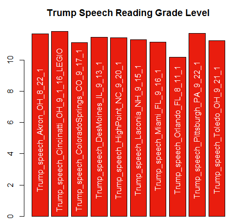
The results are easy to examine using base functions like min, max, or range. With this small sample set Trump’s speeches minimum score 10.17 while Clinton scores 10.23.
min(trump.grades)
min(clinton.grades)
I am a visual learner so I like to create simple plots to understand my data. This code creates abarplot of Trump grades with speech names and using “Republican red.” After creating the bar plot labels are added to the bars using text. The labels are shortened by 11 characters using substr to make the bars less cluttered.
grading<-barplot(trump.grades, col='#E91D0E', xaxt="n",main='Trump Speech Reading Grade Level')
text(grading, 5.5, labels= substr(names(trump.grades),1,nchar(names(trump.grades))-11), srt=90,col='white')

Polarity – Grading positive and negative tone in speeches.
It turns out both candidates are fairly similar in grade level when talking to supporters. Now let’s turn to sentiment analysis and more specifically polarity. Polarity scores text based on identifying positive and negative words in a “subjectivity lexicon.” Here qdap supplies a pre-constructed list of positive and negative words from the University of Illinois-Chicago. The polarity function tags words in the subjectivity list and applies the following steps.
- Tag positive and negative words from the
key.polsubjectivity lexicon. In more robust analyses you should customize these words. - Once a tagged word is identified the four preceding and two following terms are “clustered.”
- Within the cluster, positive words are valued at 1 and negative count as -1. Neutral words have a value of zero. The remaining words are counted as “valence shifters.” An example valence shifter is “very” as in “very good” which amplifies the positive intent. Positive valence shifting words and negative add or subtract 0.8 to the polarity score.
- The sum of positive and negative words along with positive and negative valence shifters is saved for each cluster.
- The sum is divided by the square root of all words in a passage. This helps measure the density of the keywords.
The custom function, speech.polarity, will take some time to compute. Tagging words from among thousands in a subjectivity lexicon is computationally intensive. Thus, the pblapply function is helpful. In this function the speech words are passed to qdap’s polarity. Then pluck is applied to the result so only speech level polarity measures are captured instead of individual word statistics. The list of data frames in then organized into a single data frame using do.call and rbind. The do.call and rbind combination are very helpful when dealing with lists.
speech.polarity<-function(speech){
speech.pol<-pblapply(speech,polarity)
speech.pol<-pluck(speech.pol,'group')
speech.pol<-do.call(rbind,speech.pol)
}
It turns out one of the positive words in the basic subjectivity lexicon is “trump.” Obviously Clinton uses Trump’s name a lot so it must be removed prior to scoring. I decided to remove “trump” in the speeches rather than adjust the subjectivity lexicon. Rapply recursively applies a function to list elements. List elements, “x,” are passed to the gsub function which is then applied to each element. The gsub function is a “global substitution” that replaces “trump” blank character.
clinton.wo.tr<- rapply(clinton.words, function(x) gsub("trump", "", x), how = "replace")
trump.wo.tr<- rapply(trump.words, function(x) gsub("trump", "", x), how = "replace")
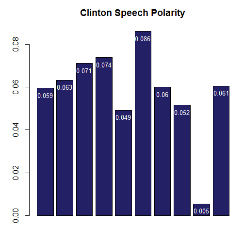
Now you can apply the speech.polarity function to each candidate’s speech words. The result is a simple data frame with 10 rows corresponding to specific speeches. Again base functions like range can help you compare results. The 10 Trump speeches have a wider range compared to Clinton, -0.024 to 0.099. Clinton’s range was 0.005, to 0.086.
clinton.pol<-speech.polarity(clinton.wo.tr)
trump.pol<-speech.polarity(trump.wo.tr)
range(trump.pol$ave.polarity)
range(clinton.pol$ave.polarity)
A simple barplot can be constructed to learn about the data. This code plots Clinton’s average speech polarity in “Democrat blue.” The text function adds the rounded polarity values in white at the top. Looking at this barplot Clinton is very positive except at her Reno speech!
clinton.bars<-barplot(clinton.pol$ave.polarity, col='#232066', main='Clinton Speech Polarity')
text(x = clinton.bars, y = clinton.pol$ave.polarity, label = round(clinton.pol$ave.polarity,3), pos= 1, cex = 0.8, col = "white")

Now that you have the data set, check out the rest of this post at ODSC!